While searching for a new house myself, I’ve been doing some more thinking on the US Housing Market. Here’s the latest.
In August 2018, I wrote about Staying Long and Strong in Real Estate, with a cautious yet optimistic view of the housing markets in most U.S. cities. I’ve been bullish on U.S. real estate since 2012, during which both the U.S. stock market and U.S. housing markets have shown considerable price appreciation.
Lately, there’s been talk of softening housing markets, which I think deserves consideration. On one hand, the stock market has been volatile and recession risk is very real right now. On the other hand, price charts of most U.S. cities look positive to me, at least longer term. Let’s dig in further…

The Housing Cycle
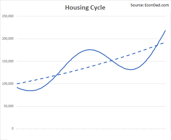
Where are we in the U.S. housing cycle? In August, I wrote about housing cycles, which occur when home prices fluctuate around a long-term upward trend: sometimes overvalued, sometimes undervalued, but generally going up over time. Here’s what a housing cycle looks like graphically (geek note: modeled as a sinusoidal wave around a low-growth exponential trend line):
The best data on U.S. home prices come from the S&P CoreLogic Case-Shiller Home Price Indexes, which are repeat-sales indexes for the top 20 housing markets across the country. A repeat-sales index is a measure of price appreciation calculated from pairs of subsequent sales of the same homes over time, to measure price appreciation. String together thousands of sales pairs over time statistically, and you can get a good estimate of the underlying price trend. I’m pretty familiar with repeat-sales indexes, including a peer-reviewed economics paper on the topic.
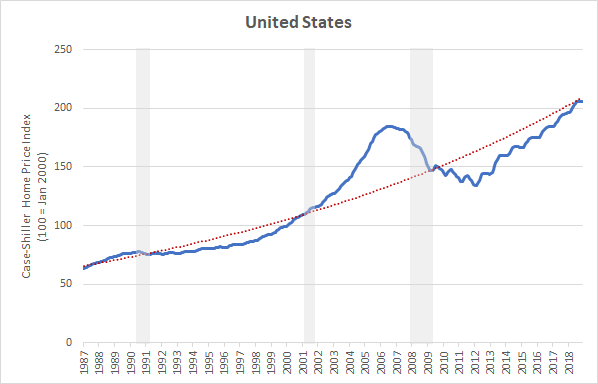
Here’s what the Case-Shiller index looks like for the United States as a whole, with the index in blue and a very simple exponential trend line in red:
There are a few things to point out here:
[1] Cycles. There are clear up and down cycles—i.e., periods of overvaluation and undervaluation. As a buyer or investor, you want to generally be buying when below trend and selling when above trend, though, of course, not taking any stance too strongly without examining the specifics of your living and investing situation.
[2] Trend line. The way this graph looks visually depends very much on how you draw the trend line. A flatter trend line would be higher within the 2005 housing peak and could make the current market look like another peak, but would not align with prices in the late 1980s. A steeper trend line would make housing today look substantially below trend, but probably puts too much weight on the mid-2000s peak.
The benefit of the long history is that it provides a benchmark for the long-run growth rate. The red line on the chart above grows at about 3.7% per year, a few percentage points above inflation. We could do more sophisticated modeling here, but the idea is to get a simple visual on the long-term average over time.
[3] Seasonality. This is a non-seasonally adjusted series, which means you can see the ups and downs within a year that have become more prominent in the last 10-15 years.
[4] Current outlook. To me, the charts look positive overall. My best characterization for most cities is that we’re close to long-term trend lines with the benefit of upward momentum—i.e., towards the middle of a positive longer term up cycle.
Local Housing Markets
But all real estate is local, isn’t it? Well, yes and no. It’s more complicated, of course. Here are the first two sentences of the paper referenced above: “All real estate markets are local, or so the conventional wisdom goes. But just how local is local?”
There appear to be national, regional, city, and local components to housing, but markets across the country are more correlated than you might expect.
Consider these two charts from Boston in the Northeast and Los Angeles in the Southwest. Despite these cities being 3,000 miles apart, they both have peaks in the late 1980s, troughs in the early 1990s, peaks again in the mid 2000s, and both have had an upward trend again since about 2012:

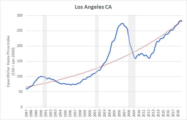
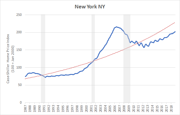
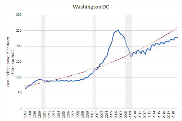
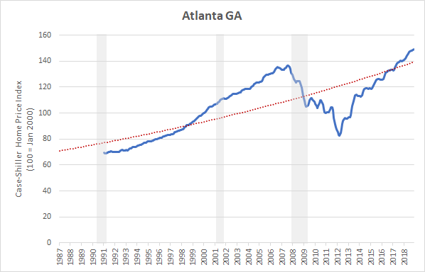
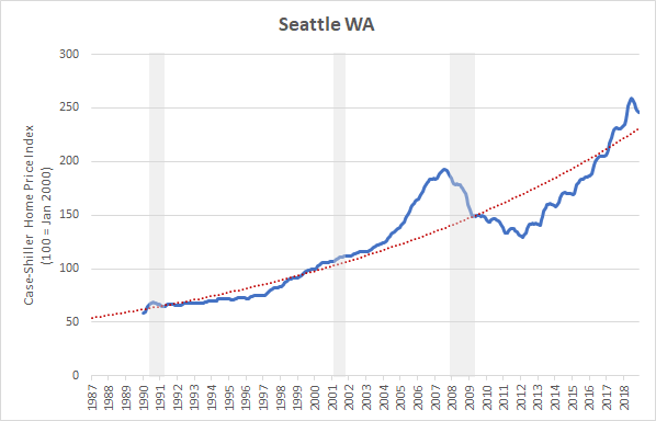
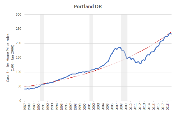
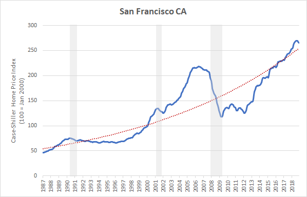
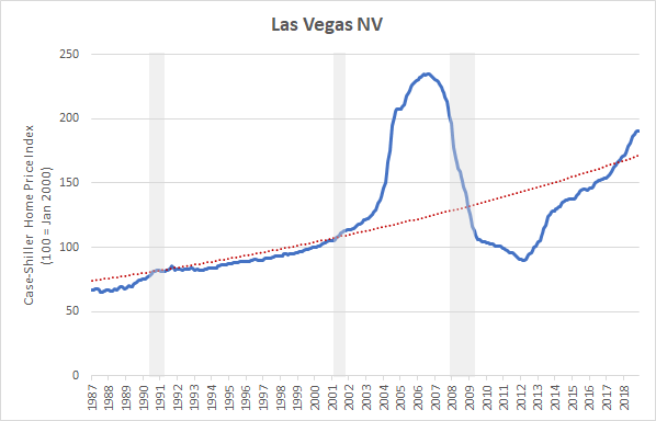
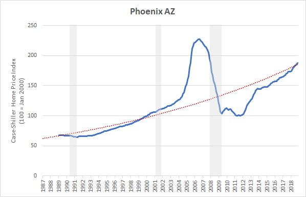
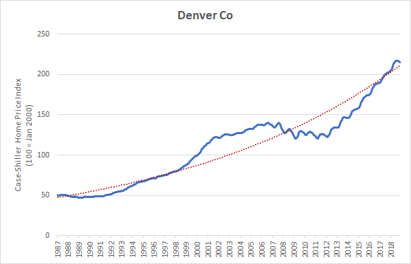
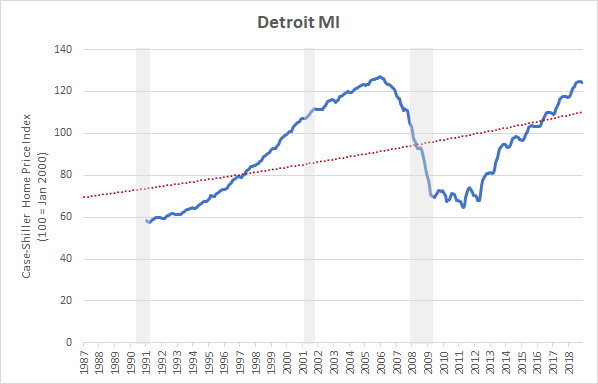
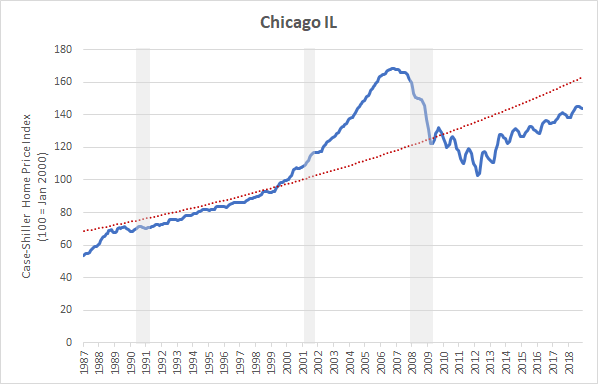
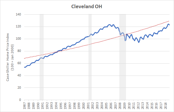
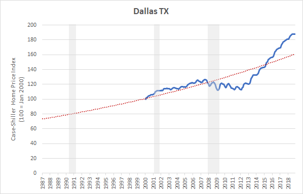
At the bottom of this page, I’ve provided similar plots for all available indexes, including: Atlanta, Boston, Cleveland, Chicago, Charlotte, Dallas, Detroit, Denver, Las Vegas, Los Angeles, Miami, Minnesota, New York, Phoenix, Portland, San Diego, Seattle, San Francisco, Tampa, Washington DC.
All plots have a red exponential trend line based on the full available data series, which is very simple and fits some cities better than others — when looking at your city, you can visually adjust the trend line to improve the fit.
There are a few things to point out here:
[1] Local markets. There is definitely some local variation. The West corridor that includes Denver, Portland, and Seattle look strong but possibly overheated. California looks fairly on trend, though not immune from a correction. The East Coast seems to be marching steadily upwards. Each market deserves its own look, depending on where you live. By the way, is it the West Coast or the Best Coast?
[2] Correlation. Despite local variation, there’s still quite a bit of correlation across markets. See how many of the peaks and bottoms align across cities? There’s something to notion of the “U.S. Housing Market” (though, market definition is often more nuanced and can depend on the context*). Want to learn more? See another chapter of my PhD dissertation: Demand Substitution Across US Cities.
Bear challenge: If you’re currently bearish on U.S. housing, how would you draw the trend line through the Boston or Los Angeles charts above to indicate that they’re overvalued or above trend? Or, alternatively, is there a good argument for why the long-term trend lines aren’t relevant?
What About A Recession?
As I wrote in August 2018, the biggest risk to housing right now is a recession in the real economy:
Economic recession. We haven’t had a recession in a while, and we seem due for one. I’ve been nearly 100% out of the stock market in recent years because I’m concerned about valuation and economic slowdown. If we have a stock market decline and/or economic recession, it would definitely put some downward pressure on home prices.
Investment Outlook: Stay Long And Strong In Real Estate
Here are a couple of thoughts:
[1] Recession risk. It’s very real right now. Stock market volatility, possibly inverted yield curve, Federal Reserve rates dropping — signs point to a potential recession in 2019 or 2020. On the other hand, President Trump just reminded us how great things are. As always, it’s a bit hard to say.
[2] Housing down cycle. Longer term, I’m not convinced that we will go into a housing down cycle, even if a recession does hit. The city housing charts below look too positive to me. That isn’t to say that prices won’t soften or that markets won’t benefit buyers in the near term, but bigger picture I’m not seeing major declines ahead. Recessions in the early 1990s and late 2000s aligned with a housing down cycle, but the recession in the early 2000s did not.
[3] Long-term growth rates. Long-term price increases depends on fixed supply and growing demand, from income and population growth within fixed city limits. Long-term growth rates range from under 3% on the low end (e.g., Cleveland, Detroit, Atlanta, Charlotte) up to over 5% on the high end (e.g., Seattle, Portland, San Francisco). Calculated rates may be impacted by near-term cycle status, but 2-5% long term seems about right for many markets. Naturally, the up cycles will have greater growth and the down cycles have lower growth.
Final Thought
Recession risk notwithstanding, I’m just not seeing a strong bear case for U.S. housing, at least not longer term. I think there’s much more risk right now in U.S. stocks than U.S. housing, and would rather hold the latter through any upcoming recession. If that happens, let’s put on our seat belts and see what how it plays out…!
Related posts:
- Aug 2018: Investment Outlook: Stay Long And Strong In Real Estate
- Nov 2009: Long-term Housing Cycles
- Jan 2009: Slow-Motion Housing Cycles

* As an aside, market definition can be nuanced and controversial in certain contexts. In the above post, I’m not seeking to specifically define or comment on any relevant economic markets; rather, I’m simply using shorthand to describe what I’m referring to.
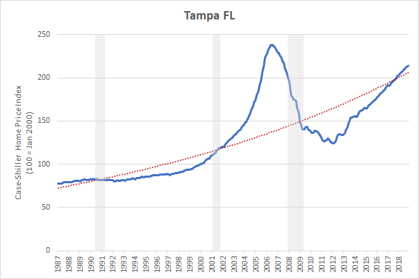
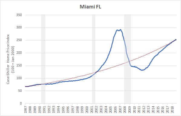
Home Price Charts
Charts below plot the S&P CoreLogic Case-Shiller Home Price Index data as downloaded from the St. Louis Federal Reserve Website on February 1, 2019. Shaded recessions come from the National Bureau of Economic Research. A simple exponential trend line using the full available data has been added in red.
United States

West Coast


West Center
East Center

East Coast

